Casal Garcia is a light, crisp whit wine fro Portugal that dates back to 1939.
Casal Garcia was named after the land where the first grapes of the wine came from. The brand stays true to its origin by incorporating the lace of the
Guedes family who first produced the wine in order to pay homage to their families dedication.
Although the Casal Garcia label has won many awards for it's design due to their dedication to tradition, their label still doesn't work on an aesthetic level. To me the brand, with its colors and type placement reminds me of Private Selection, Kroger's brand of products. In order to raise Casal Garcia onto the pedestal that the brand deserves the label must give off an air of elegance and sophistication that it currently lacks, while at the same time still holding true to the tradition that the name implies. I will achieve this by focusing on the initials of Casal Garcia and incorporating the lace onto the lettering instead of across the entire background. The letters will be enlarged showcasing a delightful illustrative quality that will engage the consumer. Type will be kept very clean and crisp in order to emulate Casal Garcia's well-known light and crisp taste; this style of typography will also help bring Casal Garcia into a more modern light, which will appeal to a broader range of consumers.
In terms of a color palette I will use colors that play nicely with the yellow of the wine, since I plan on leaving so much "white" space on the bottle to achieve a clean look. I plan to use either a black or white for the enlarged illustrative initials, which will contrast nicely with the slight yellow of the wine inside the clear bottle; all other type on the bottle will be either black or white as well depending on the color chosen for the initials (I'm also considering using an orange for the secondary type).
For the bottle case I would like to use a rich wood with an interesting latch for opening. I believe this wood will give an old-world feel to the wine which will give off a sense of elegance to the wine as well as incorporating
Casal Garcia's strong ties with tradition. In order to keep up with consistency I will incorporate small hints of the lace element
implemented into the label design, tying in the two elements and making it more of a set instead of two
separates.

 start off the day by waking up at an ungodly hour!
 coffee coffee coffeee-i wouldn't make it through the day without it.
 head over to christine's place of employ in order to get my magazine printed for laura's class.
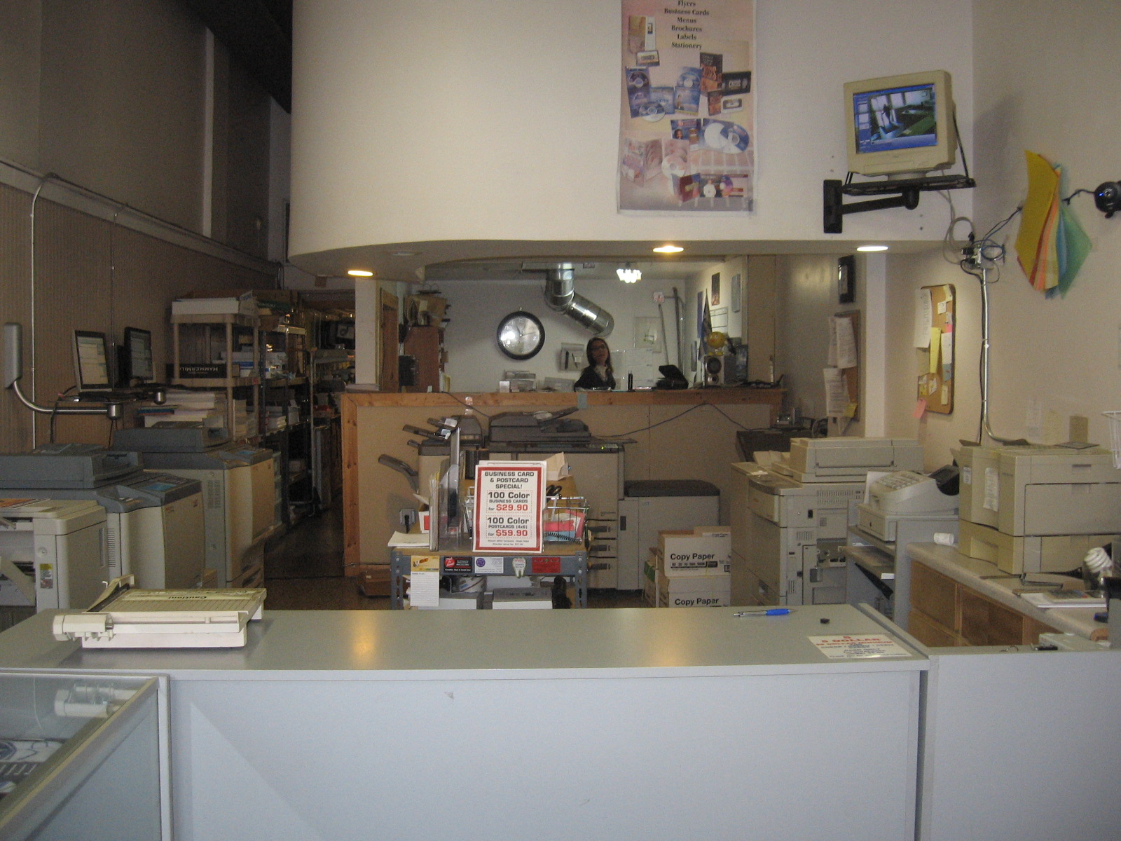
 run into some classmates along the way!
 jacolby is my hero. he helped me rearrange my layout for printing.
 off the paige's class. john being silly as usual.
 oh boy! my flashdrive decides not to work!
 ending the day at my boyfriend's house to work on my website for paige. while doing so we discovered two mysterious black dots on the bottom on stu's foot, so i completed the look by adding a mouth! i love stu, if i'm stressed and freaking out he always manages to calm me down and keep me grounded. i am a lucky girl.